Project Roots: Web Redesign for Non-profit
Lead UX Designer
Project Director
Role
Client
Timeline
December 2022 - January 2023
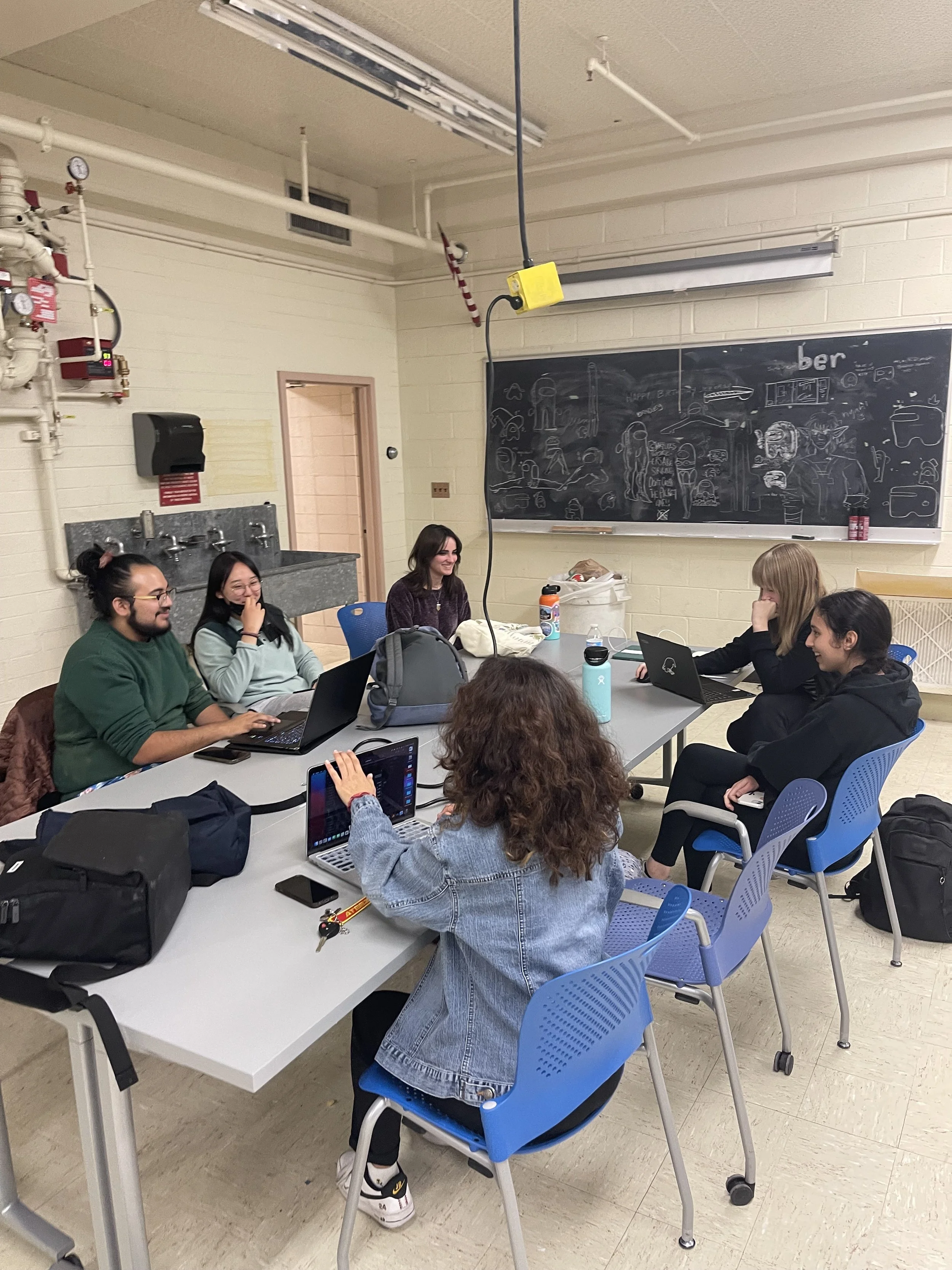
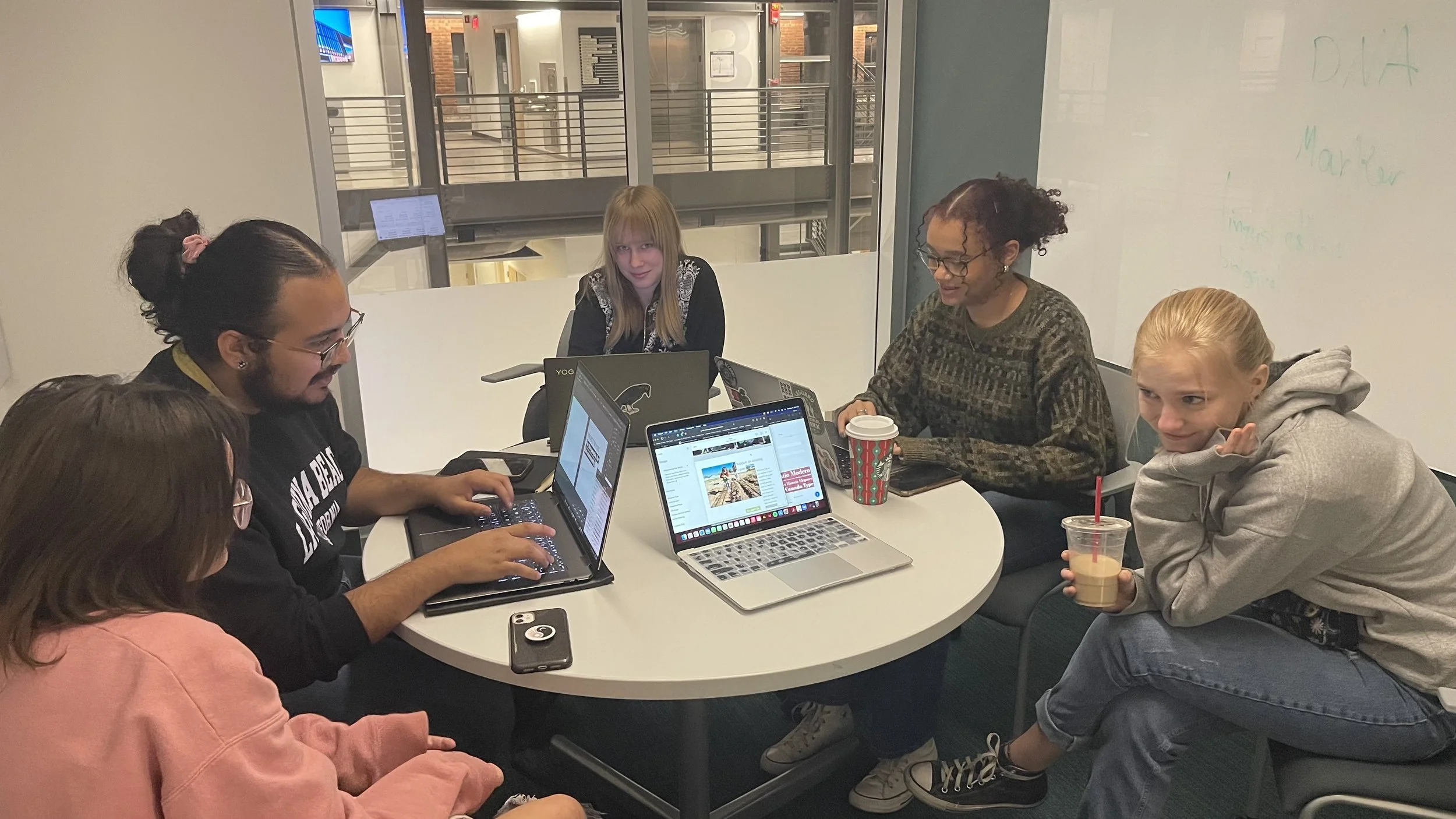
Team of 8 students in University of Arizona’s first student-led UX and Design Club: Unity X Design
Team
Status
Not implemented due to the establishment no longer active.
Overview
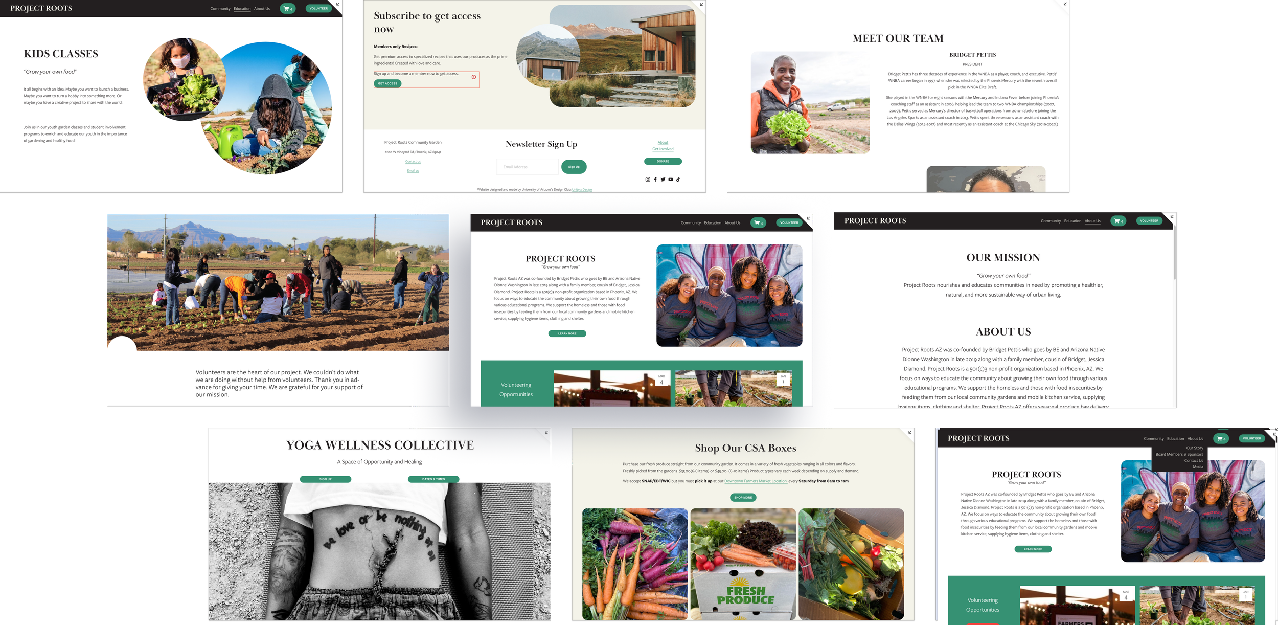
Project Roots AZ was co-founded by Bridget Pettis who goes by BE and Arizona Native Dionne Washington in late 2019 along with a family member, cousin of Bridget, Jessica Diamond. Project Roots is a 501(c)3 non-profit organization based in Phoenix, AZ. They support the homeless and those with food insecurities by feeding them from our local community gardens and mobile kitchen service, supplying hygiene items, clothing and shelter.
Who are Project Roots?
Why did we chose to work with them?
I went on a tour of Project Roots community garden located in Phoenix for a school trip, and I as we were discussing with Dionne, one of the founder of Project Roots, about her work for her Non-profit. She then mentioned that their website is “bad” and that the site barely gets any traffic. But what does a “bad website site” actually mean?
Then I offered my help, as I founded a UX club at my University and I thought it would be a great project for us and a great opportunity for Project Roots to get a new and improve website so they can continue supporting and doing the important work for their community.
Problem
Non-profit sites are a hub for resources and information, from donations to volunteering opportunities. But users are having a hard time navigating the site and accessing those points of support. It reduces the chances of the users who want to help by donating, volunteering, etc. because they can’t navigate the site, leaving both the Non-profit and the user audience frustrated and leaving a reputational and business disadvantage to the organization.
Solution
By reflecting on HMWs (How Might We), we came up with the solution of creating a better user flow through the site, and by emphasizing the important resources and content that the Stakeholders want to share. Working with both the Client and Users specific needs by taking a business approach.
Challenge
How do I manage a team of of 10 interdisciplinary students through a big Web Redesign, Communicate with the Stakeholders, and participate as a designer as well? Answer—> Have an amazingly passionate and hardworking team who support each other!
We took the responsibility of the main design team as well as the web development team, as the Stakeholder uses squarespace for their current site. We decided it was best to keep the redesigned site on Squarespace so the client can easily update and manage the site on thier end. But it also brings up the challenge of learning squarespace and being limited by their design features and web building technology. So we had to think from both the frontend side and technicallity side.
Research Phase
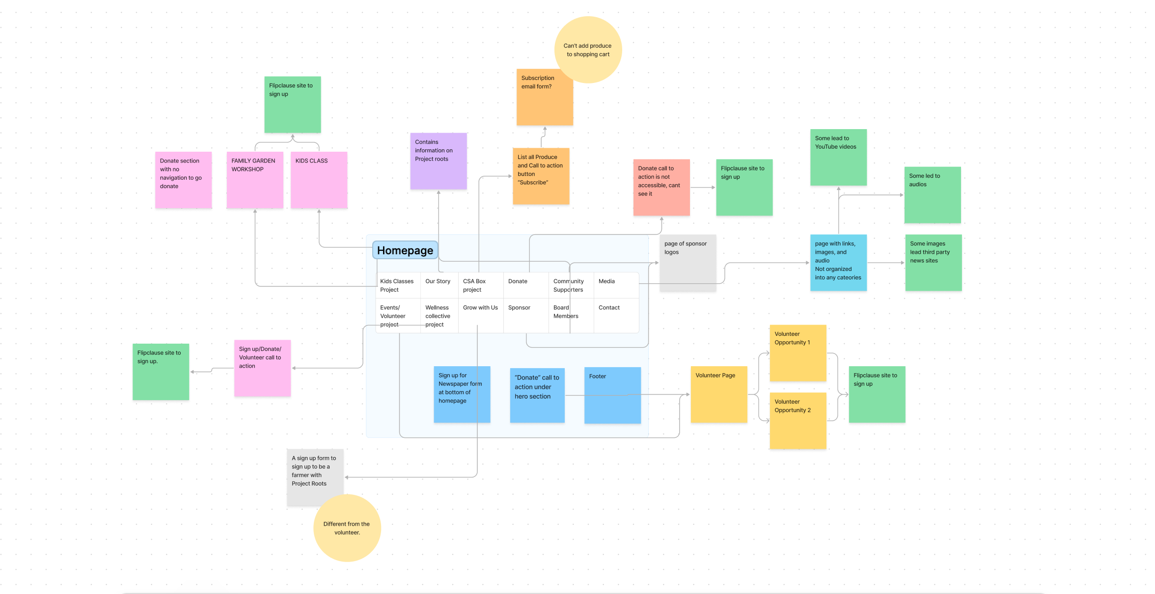
we first conducted a thorough content mapping of their existing website. This involved mapping out their content, call-to-action buttons, links, and user journeys to gain a better understanding of the site's layout and functionality.
This content map allows us to get a broader visual perspective on how their current site is laid out out.
Preliminary Content Mapping
We first began our research by facilitating a stakeholder interview with one of the founders of Project Roots, Dionne Washington. We asked her a range of business, user experience and branding questions:
What are concerns that your user audience have brought up to your attention?
What are your long-term goals for the site?
What are things that are doing well on the site?
What do you hope to see improvements on after our work together?
What are resources that you would like to promote more?
What visually would you like to see happen on the site? what feeling do you want your users to experience?
Stakeholder interview
Our Research Findings
Two main areas of focus: Volunteering & CSA Boxes
Based on our stakeholder interview Project Roots has expressed their concerns with little traffic for the volunteering page and CSA boxes page. These two resources are two of the main way they receive revenue and help for their organization.
difficult navigation and user flow
There were limited access points from the homepage. the only point of navigation on the home page was the menu but it was cluttered and confusing. Content and resources were difficult to find and scattered throughout the site.
Poor accessibility measures
Low levels of contrast between the fonts and colors of the website. It was also not mobile accessible and relied mostly on desktop to properly function. The links and buttons were not properly emphasized. It was not screen-reader accessible for those with visual impairments.
Design Goals

Improve Information architecture and content flow

Improve accessibility for as many people as possible

Promote all the resources they offer to a wider group of individuals
Design Process
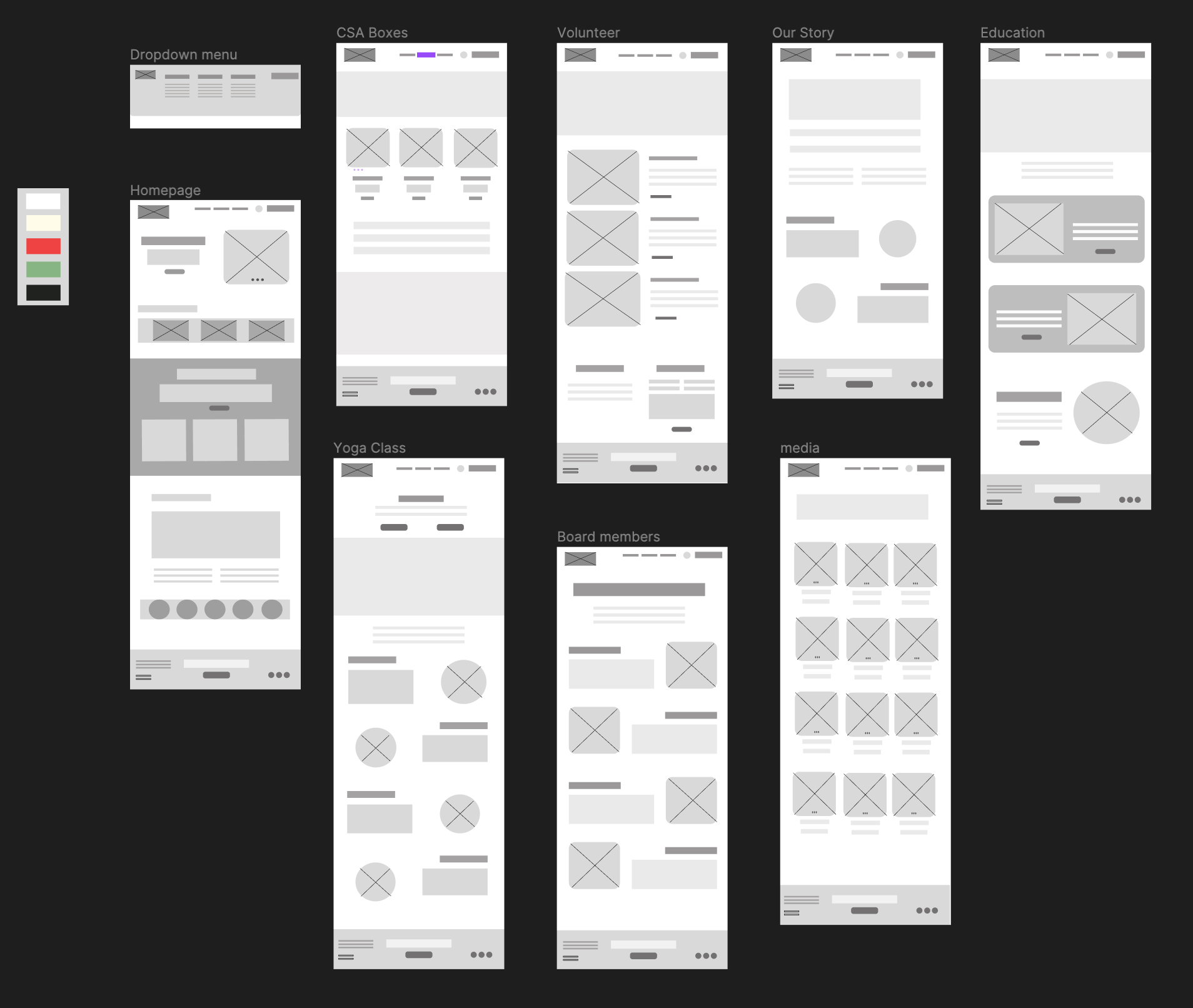
After our research I began loosely designing the wireframes. We have worked through many process of making changes with both the Stakeholders and critique/feedback time from our other team members.
Low Fidelity Wireframing
Group Debrief and Mid-fidelity Design
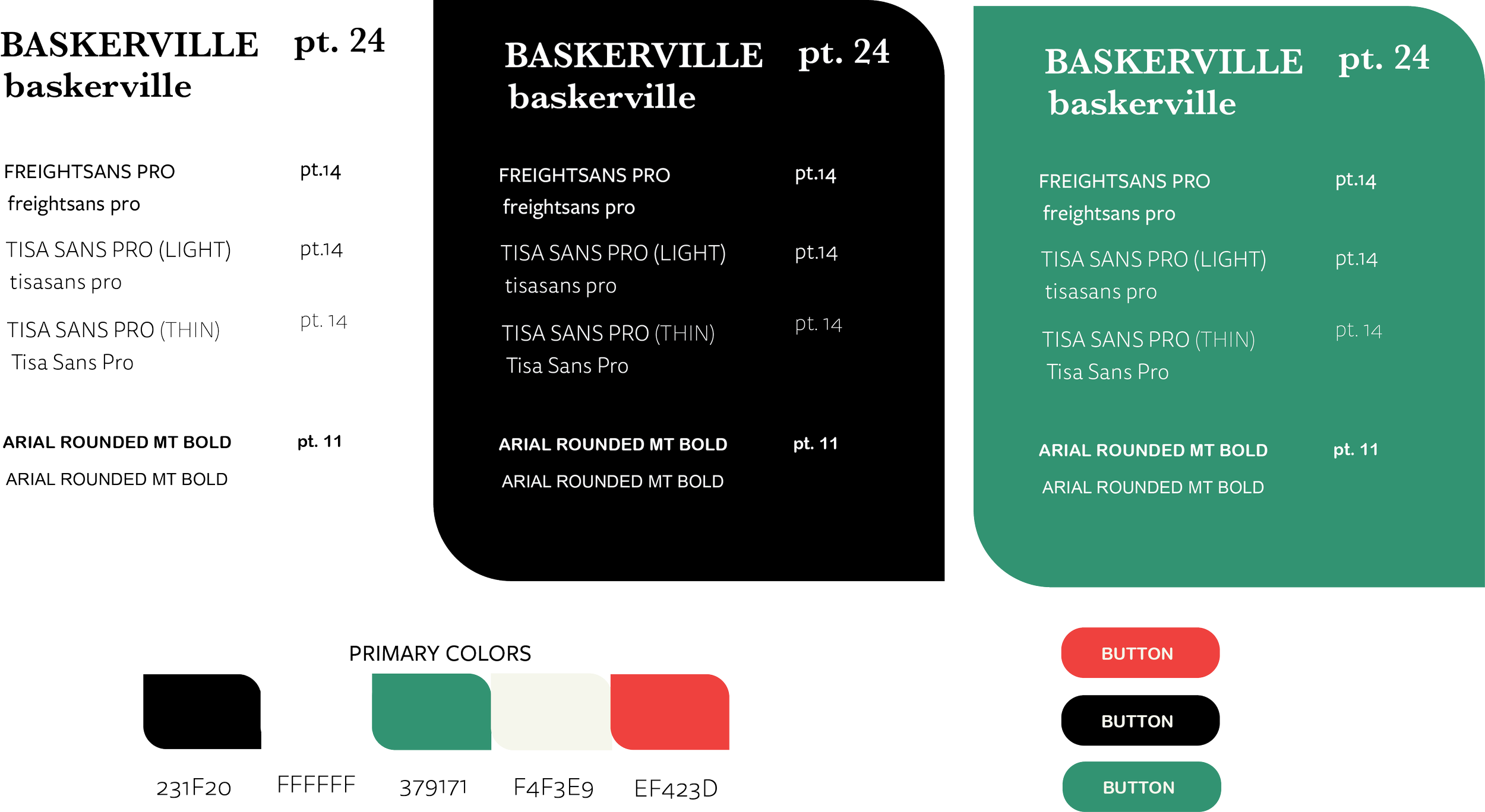
After the low-fidelity wireframing got approved by the stakeholders we began roughly implementing our branding identity to see the visual layout and emphasis. Each team member got assigned a page to implement the design. While each member design their page we would often meet together to run through concerns, critiques and changes along the way. As a lot of the team member were student still learning about UX, this allowed them to better understand the ux process by observing and contributing in ways that they feel confident in doing so.
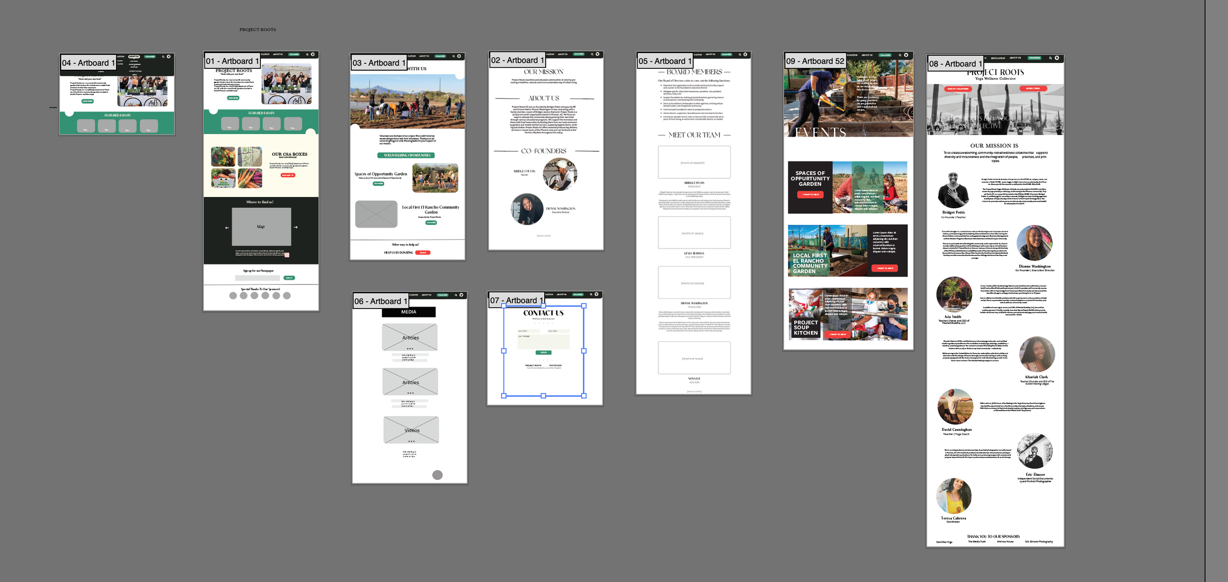
Areas of focus
With relations to our research findings, we have decided to focus on the Navigation, CSA boxes and volunteering page.
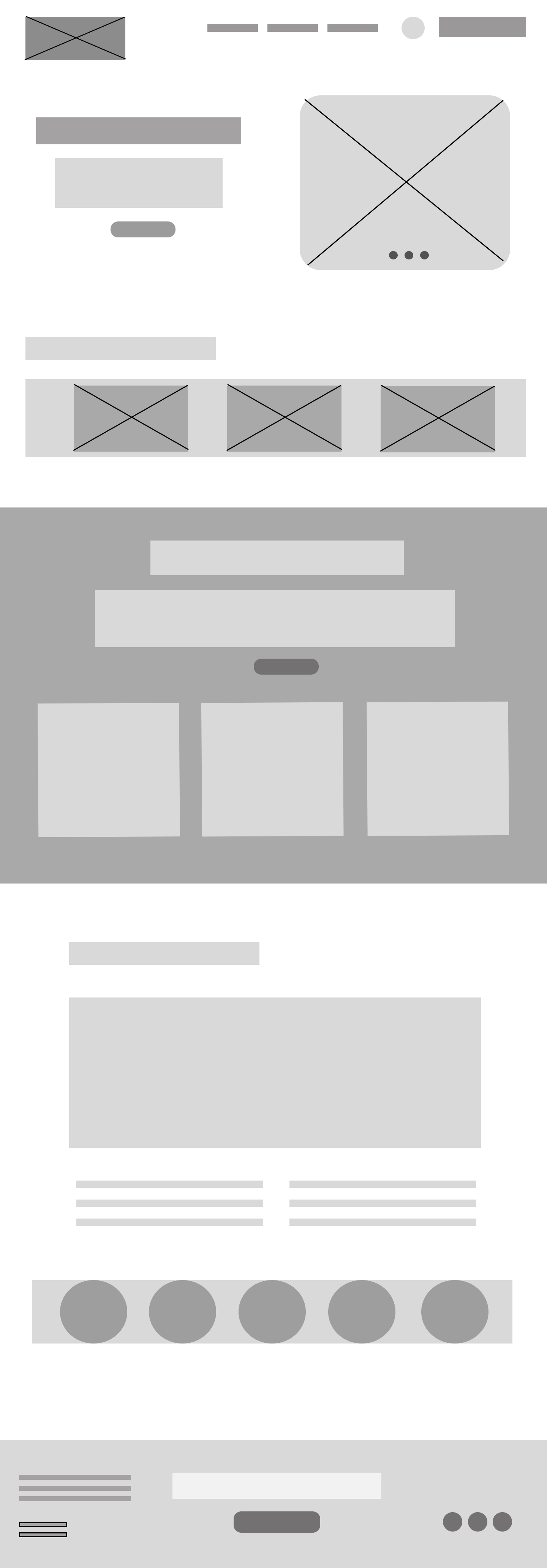
For this wireframe, you can see the changes we made. We added three highlighted sections to the homepage to improve promotion of the CSA boxes and Volunteer page as well as created a central information hub on the Homepage.
The homepage & Menu
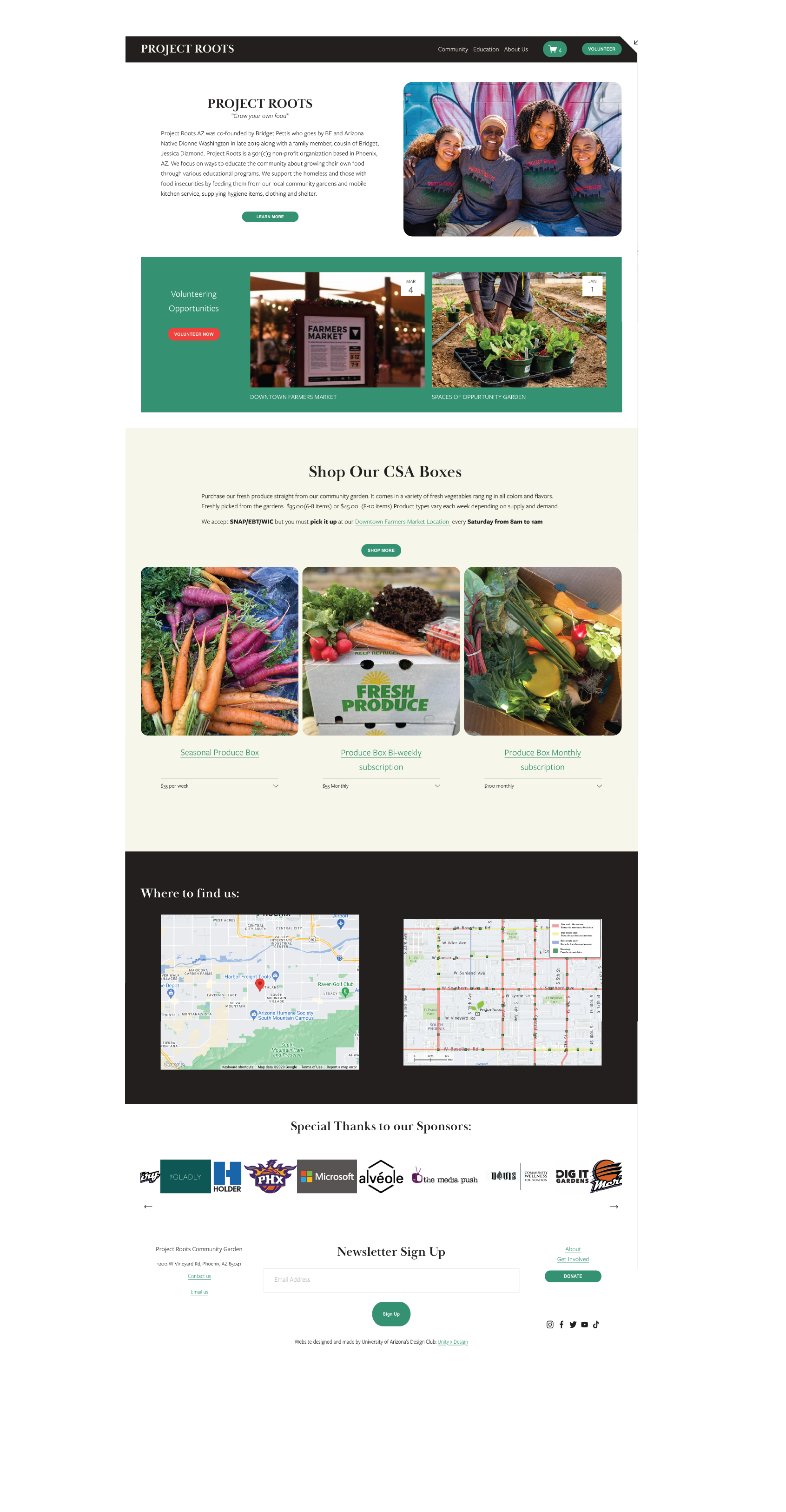
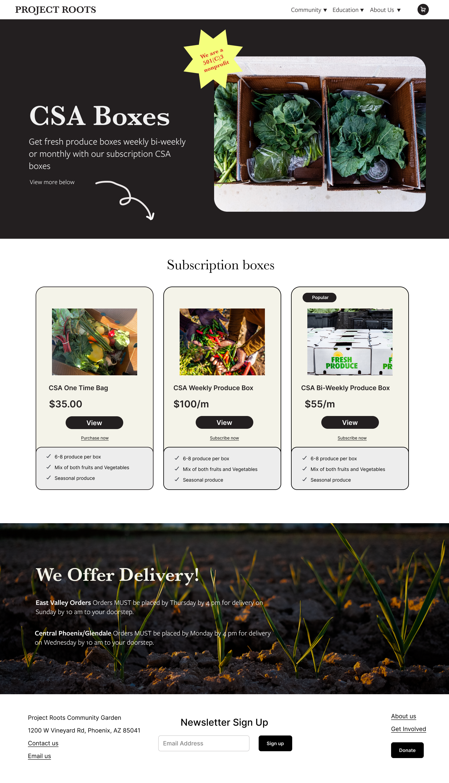
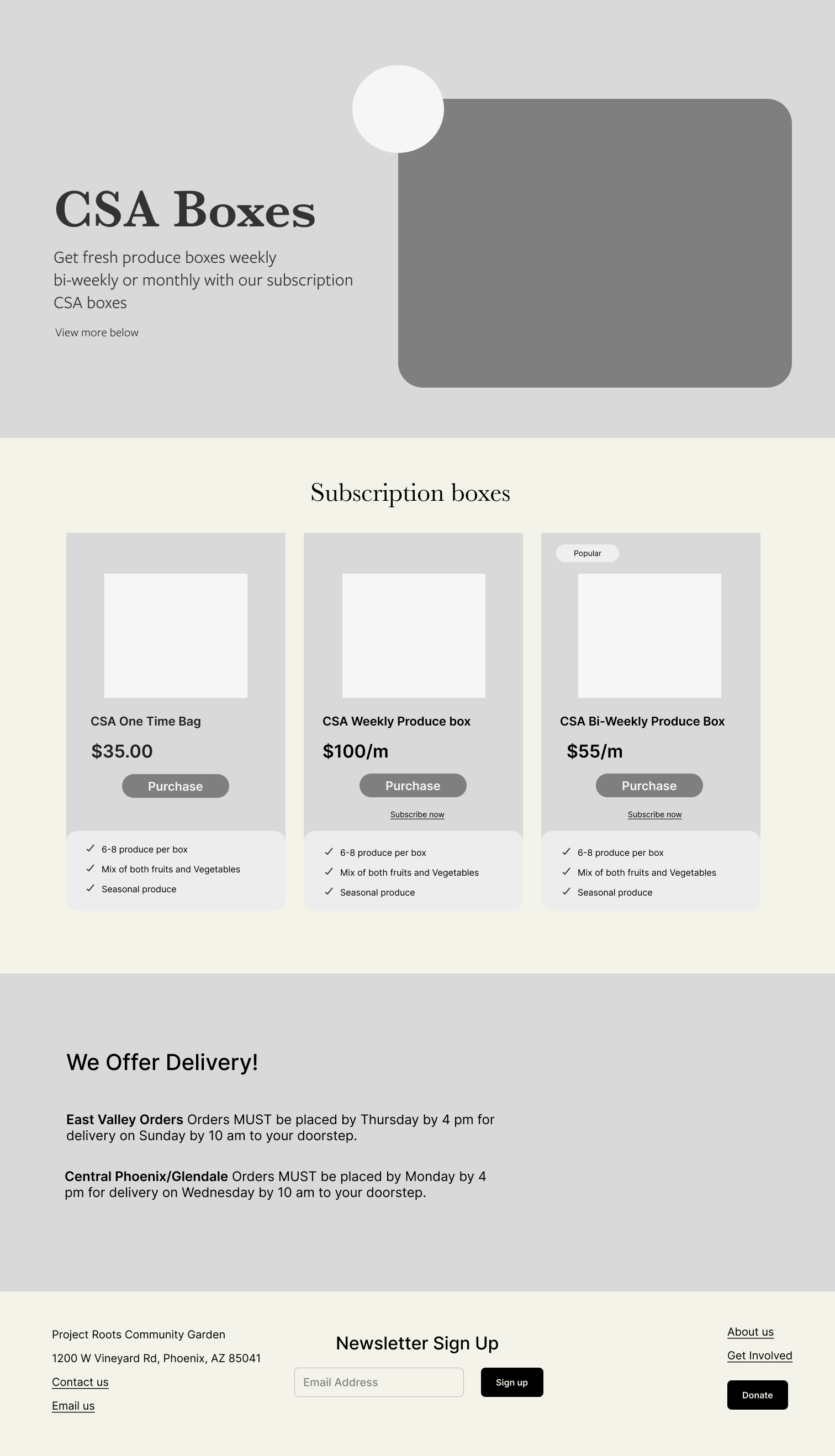
Their original CSA Boxes page had an inconsistent e-commerce structure. Users had a difficult time finding where to purchase and where to subscribe.
We improved the buying process and made it a simple e-commerce subscription page where users can add products to their cart and purchase the subscription right away.
The CSA boxes E-commerce page
Branding
Takeaways
This project was my first big client work and as it was a bigger project, I decided it was a good project for my club to work on as well (with approval of the client). Leading this project as well as participating in it was a big responsibility that I was taking on but with the help and support of my team, the project was a success.
I learned a lot about leading and project management as well as what it is like to work closely with a team and the importance constantly critiquing and giving feedback on the work that we were doing.
I also learned the more business side of UX as well, from working with Project Roots we had to switch between user thinking and business thinking and finding a good balance for the both the client and the users.
Next Steps
As the website has just been completed we are waiting for Project Roots’ board to approve of the website for it to be live soon.
We will continue to work on the site as through the cycle of UX. We will periodically perform usability testing and more research to improve the site as much as we can. We are planning on creating a content editing guide for them so they can update content, images, and other information into their new website.
Special Thanks
Special Thanks to my Club: Unity X Design for working so hard and navigating such a big project as beginner UX designers!
And thank you to our Client: Project Roots for giving us this opportunity to work on your website and being patient and supportive of our team!